The lifeblood of music
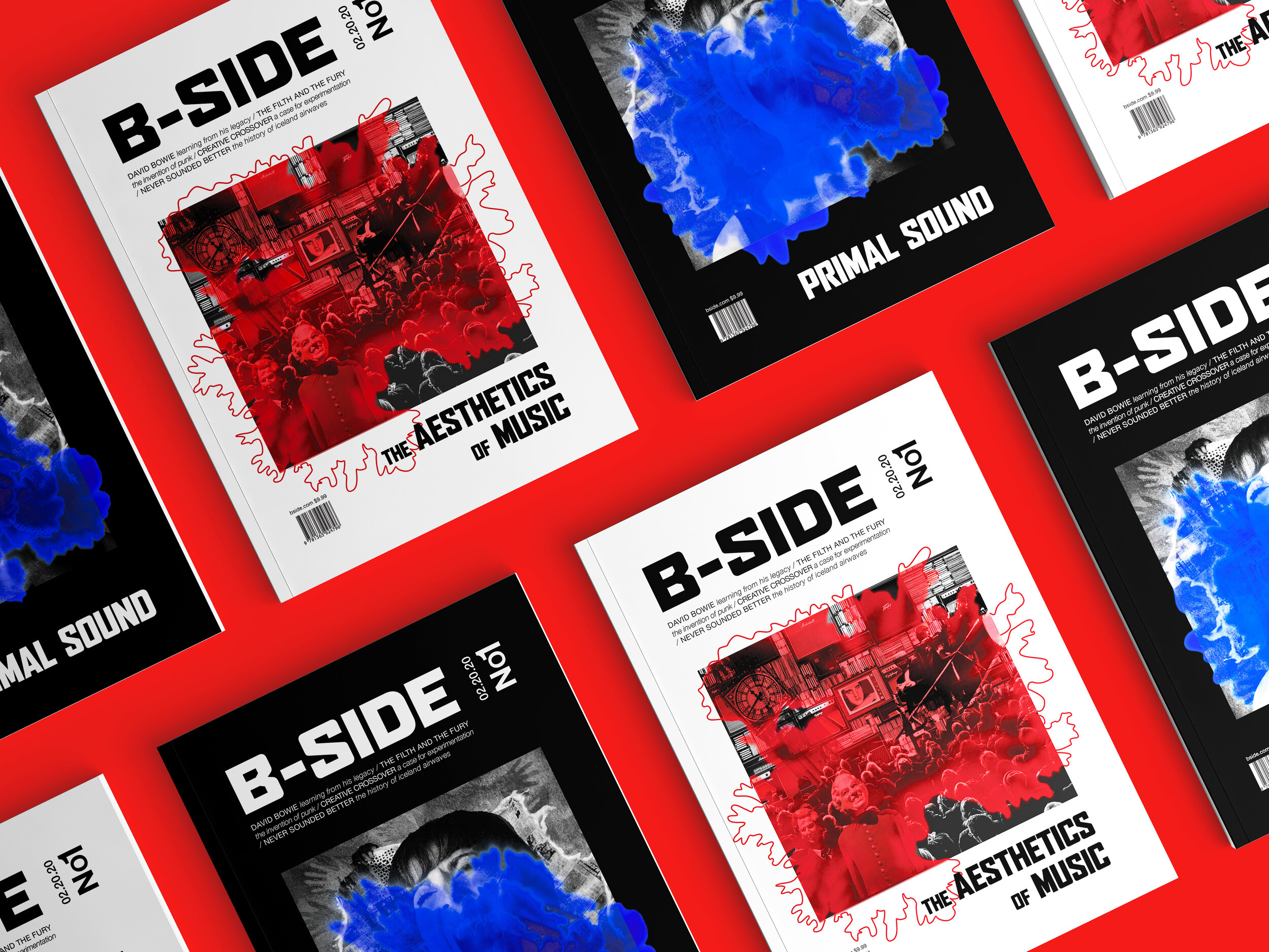
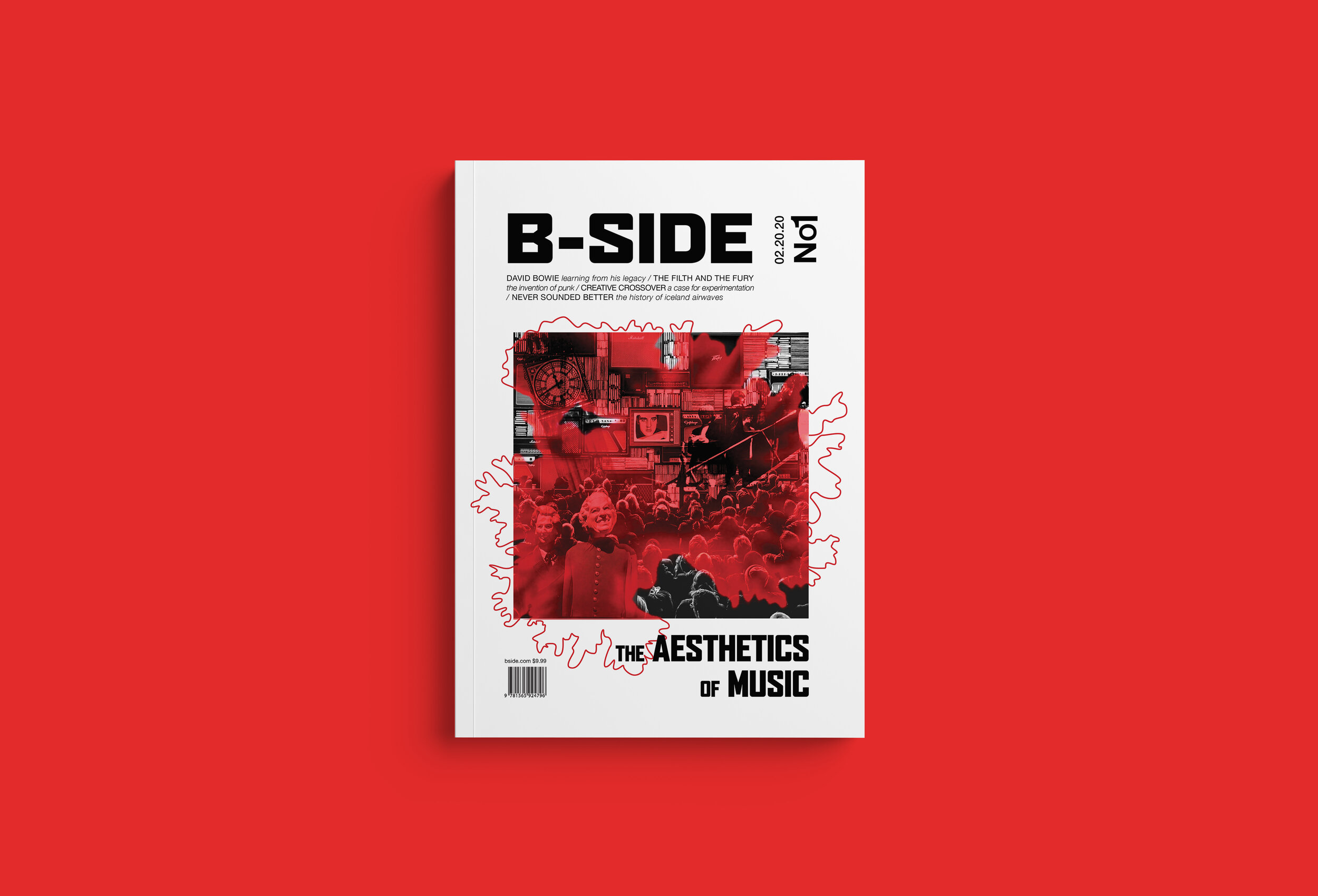
Typesetting for editorial design with handmade cover art for a new music magazine
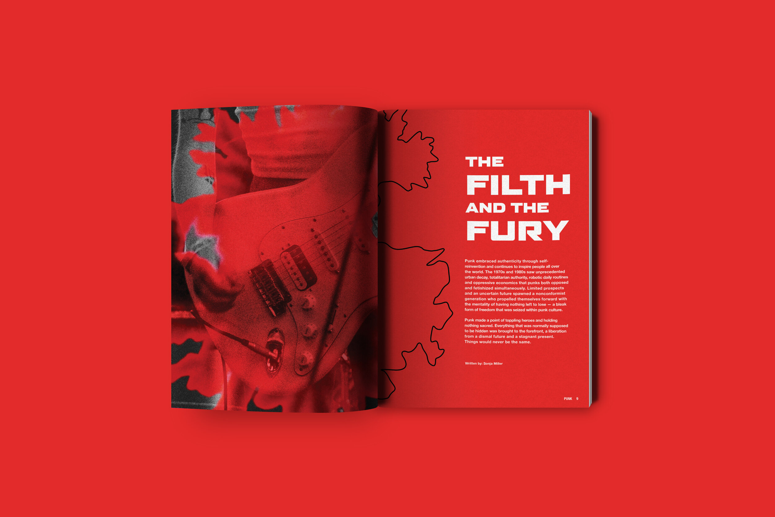
For this first issue of a new magazine, catering to music super-fans, the focus was on the birth of punk music in the late 1970s. Punk music has an incredible DIY aspect to it — whether or not it looked good in the mainstream, there was an innate need to lash out and create music. Rather than reflect now-stereotypical aspects of the aesthetic — mismatched type, torn edges — I wanted to create something more visceral and organic. By mixing mediums on paper, I was able to create these amorphous shapes with their strange, pulsating quality, reflecting the blood, sweat, and tears the early punk bands poured into their music. I sought to continue the jagged, raw feel in the article’s layout, defying the conventions — just as the subject matter did in the 70s — to create a shape wholly unique to the text.


